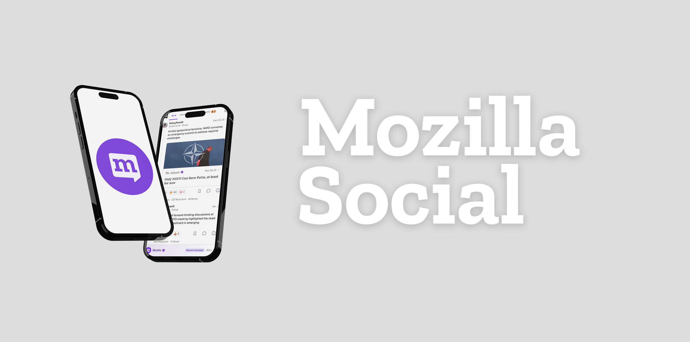
Moz Social
Introduction
In the ongoing year-long development journey of Moz Social, Mozilla has been committed to crafting a groundbreaking content curation app. This platform represents an evolution from the previous Pocket application, with a strong emphasis on user control, safe discussion, and personalized content curation. While the majority of the app had been designed and developed during this period, a specialized 6-week design sprint was allocated to fine-tune and perfect the Collections and Summaries features. This focused effort aimed to seamlessly integrate Collections and Summaries within Moz Social, emphasizing user experience and cohesion with the existing app. Figma, a collaborative design tool, played a pivotal role in this refinement process.
Indigo Slate, a mobile app design company, was entrusted with the task of designing Moz Social. Led by Creative Director Jeremy Bonner, the design team included myself as the UI/UX designer and Nikole Gramm as the other UX designer.
Objective
The 6-week design sprint undertaken by Indigo Slate aimed to perfect the Collections and Summaries features, ensuring its alignment with Moz Social's overall design and user experience, thus fostering a cohesive and engaging platform. The objective of this sprint is to explore a variety of new content discovery use cases and user experiences and produce artifacts for user/concept testing, leadership alignment, and partner/publisher/influencer outreach.
The goal is to explore how curation can be a creative process and its appeal to both publishers and mass-market consumers. This involves the creation of Collections, expertly curated lists of multimedia content covering various topics. These Collections can be curated by individuals, publishers, or through machine learning. The aim is to aid users in discovering diverse content and delving deeper into their interests. Use cases include public sharing and consumption of collections, sharing within a smaller circle, and building personal collections over time. This exploration focuses on how these experiences will evolve for users in the first year of the product's life.

Expected Deliverables
In this project, the expected deliverables are structured around a proposed weekly cadence, aiming to provide visual outputs for each phase. This approach allows for a smooth transition to user testing for each asset. The deliverables are sequenced as follows:
Collections & Curation as Creation:
- Exploring the process of creating and curating collections.
- Understanding how collections are discovered and engaged with.
- Identifying unique aspects that differentiate collections and add value for users.
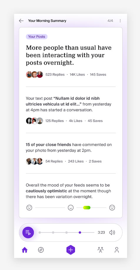
Summaries:
- Placement of summaries within the product interface.
- Comparison and exploration of summarization versus enabling deeper exploration.
- Exploring summarization as push, pull, or a combination of both.
Team & Timeline
In this case study, my role was one of 2 UX/UI designers focused on refining and optimizing the Collections feature within the Moz Social app. Using Figma, I designed high-fidelity mockups, concentrating on enhancing the user experience and ensuring the seamless integration of Collections within the app. The objective was to address the specific needs and preferences of audience, striving for a cohesive and engaging content curation experience that aligns with Moz Social's design language and user-centric vision.
Team Members
The team consisted of:
- Jeremy Bonner - Creative Director
- Nikole Gramm - UI/UX Designer
- Myself - UI/UX Designer
Timeline
The sprint spanned over a rigorous 6 week period, commencing from initial ideation to mockups and delivery.
Week 1: Research
Creative Brief & Pocket Future Audience Research
During the research phase, my colleague Nikole and I diligently examined both the creative brief and Pocket Future Audience Research document. These materials were pivotal in comprehending the project's goals and delving into the specific requirements of the Pulse Professional—a high-earning, time-constrained individual between the ages of 25 and 44, often found in industries like finance, media, marketing, and technology. This audience values being well-informed across diverse interests but grapples with time limitations, making efficient information consumption a priority. We aimed to grasp the audience's characteristics, behaviors, and preferences, which significantly influenced our design strategies. This detailed exploration of project documentation provided crucial insights, guiding our approaches to ensure alignment with the audience's expectations and the overarching objectives of the Moz Social app.
Insight 1: Target Audience
Moz Social caters to a diverse user base, notably including the Pulse Professional. This audience thrives in dynamic sectors such as finance, media, marketing, and technology, seeking to stay on top of a broad spectrum of interests amidst their hectic schedules. These high-earning individuals value staying informed but encounter time constraints, making efficient information consumption a priority.
The Pulse Professional, integral to Moz Social's user base, actively engages online, displaying a strong inclination towards seeking quality content and diverse perspectives. Amidst the daily hustle of work and family responsibilities, they face challenges in staying updated, often feeling overwhelmed by the sheer volume of information. With a strategic approach to information consumption, they carefully curate content and actively engage in select groups, reflecting a deliberate pursuit of a comprehensive, high-quality understanding of their interests, balancing their quest for knowledge within their constrained schedules. This audience's behavior is characterized by an intentional quest for diverse, well-rounded information that enriches their understanding, highlighting the significance of quality content consumption within their busy lives.


Insight 2: Audience Behavior
Because I'm focused on refining Moz Social's Collections and Summaries features, the behavioral insights about Pulse Professionals offer valuable insights. Their active engagement across devices like phones, laptops, and desktop computers, along with their interaction with influencers, especially on YouTube, is noteworthy. Their preference for expert-curated content and their careful approach to sharing, contributing content when it adds value, is an important aspect.
Their strong desire to stay updated, affinity for Apple products, and use of Chrome as their browser of choice are prominent characteristics. They consciously seek diverse news sources to gain a comprehensive understanding of various perspectives, reflecting a commitment to thorough research and a desire to avoid echo chambers. It's also interesting to note their willingness to invest in news subscriptions and active participation in content-sharing groups, indicating their dedication to acquiring quality, diverse perspectives and a deep understanding of their interests.
Week 2: Sketches & Wireframing
Design System Review
For week 2, my process involved a detailed examination of the established design system and a comprehensive study of the existing mockups. This meticulous review allowed me to deeply understand the visual and structural elements, ensuring alignment with the established design language of the Moz Social app. Subsequently, this informed approach guided my sketching process, enabling me to create wireframes and initial designs that were consistent with the app's overall aesthetic and user interface requirements. This method ensured that the new designs seamlessly integrated into the existing framework, maintaining visual coherence and a consistent user experience within Moz Social.
Formulating Guiding Questions
Before commencing the sketching process for the Collections feature, I drafted a series of targeted questions to guide and structure the design direction. These questions were meticulously crafted to delve into various aspects of the feature, such as its creation, curation, user engagement, and its distinct value proposition for Moz Social users. By formulating these questions, I aimed to gain a comprehensive understanding of the user needs, their interaction with the feature, and how it would seamlessly integrate into the app's existing framework. This preparatory step served as a strategic foundation, ensuring that the subsequent sketches were purposeful and aligned with the envisioned user experience and objectives of the Collections feature within Moz Social.
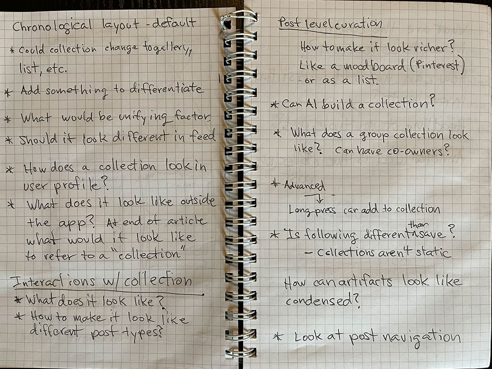
Sketches
The sketches I created during the design phase were centered on aligning with the established design system of Moz Social. These sketches aimed to conceptualize and visualize wireframes and initial designs for the Collections feature. Focusing on maintaining visual consistency and a seamless user experience, the sketches sought to translate the existing mockups and design language into practical and visually coherent representations. The goal was to craft a foundation for the feature that not only harmonized with the app's aesthetics but also ensured an intuitive and engaging user interface for the Moz Social audience.
Sketch of editing a user's collection.
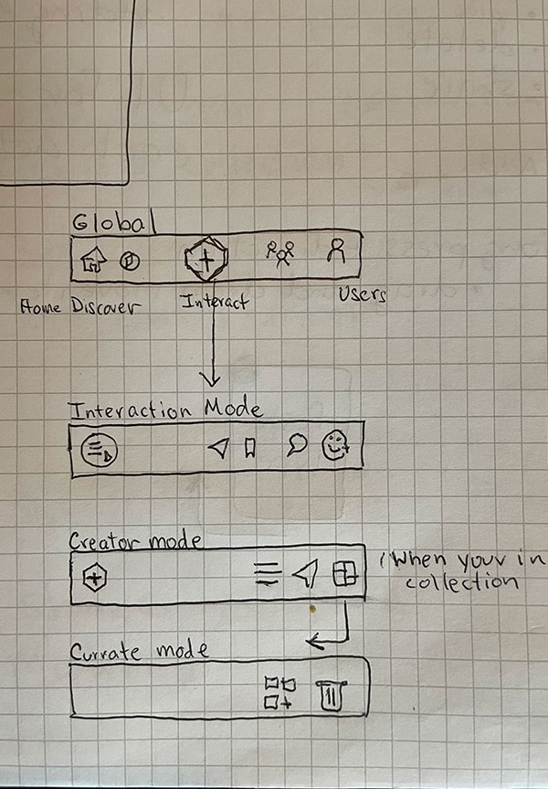
Sketch of a similar app's navigation used for comparison.
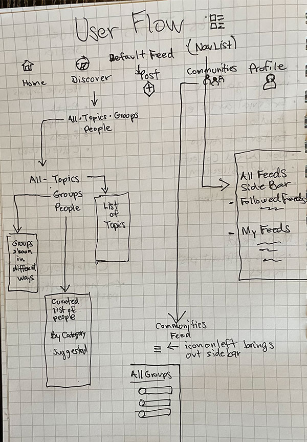
Sketch of Moz Social user flow to a collection.
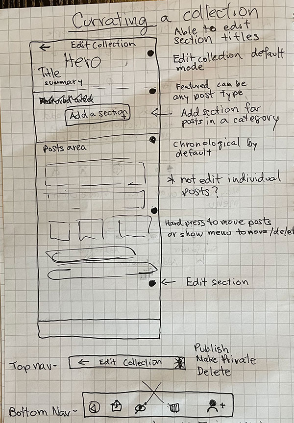
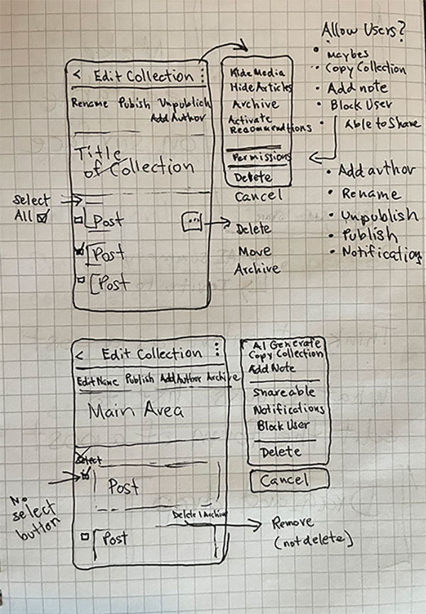
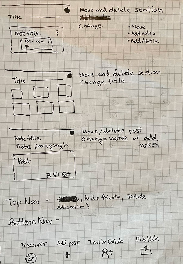
Sketch of currating a collection in Moz Social.
Sketch of Moz Social user flow to a collection.
Sketch of currating a collection in Moz Social.
Wireframing
In the wireframing phase, I translated insights from initial questions and research into clear visual blueprints for Moz Social's Collections feature. Leveraging the established design system and mockups, I sketched wireframes focused on simplicity and user clarity. These wireframes outlined the essential structure, emphasizing key elements like content creation tools and discoverability features. Through an iterative refinement process, the wireframes evolved organically, addressing usability concerns and incorporating user feedback. This phase laid a solid foundation, serving as a strategic visual roadmap for the subsequent design iterations.
Weeks 3 and 4: App Mockups
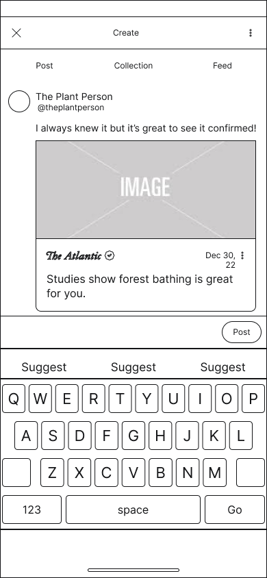
After finalizing the wireframes, we transitioned to creating high-fidelity mockups to bring the Collections feature to life with detailed visuals and interactions. Using Figma, we incorporated the established design elements and visual language of Moz Social, ensuring consistency and cohesion throughout the app. These mockups added color, typography, and precise layouts, providing a realistic preview of the feature. We focused on fine-tuning the user interface, enhancing the aesthetics, and improving the overall user experience. This phase involved close collaboration and iterative feedback to refine the designs, ensuring they met both user needs and project goals. The high-fidelity mockups served as a comprehensive guide for the development team, bridging the gap between conceptual wireframes and a fully functional product.
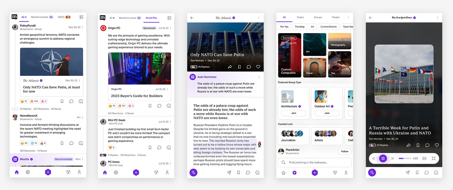
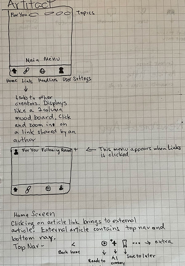
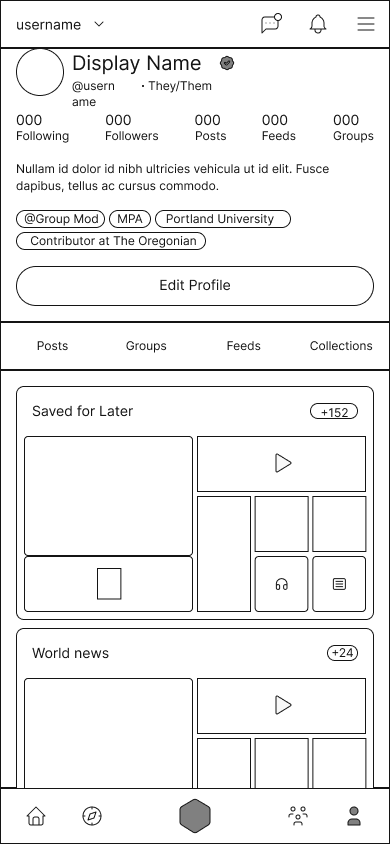
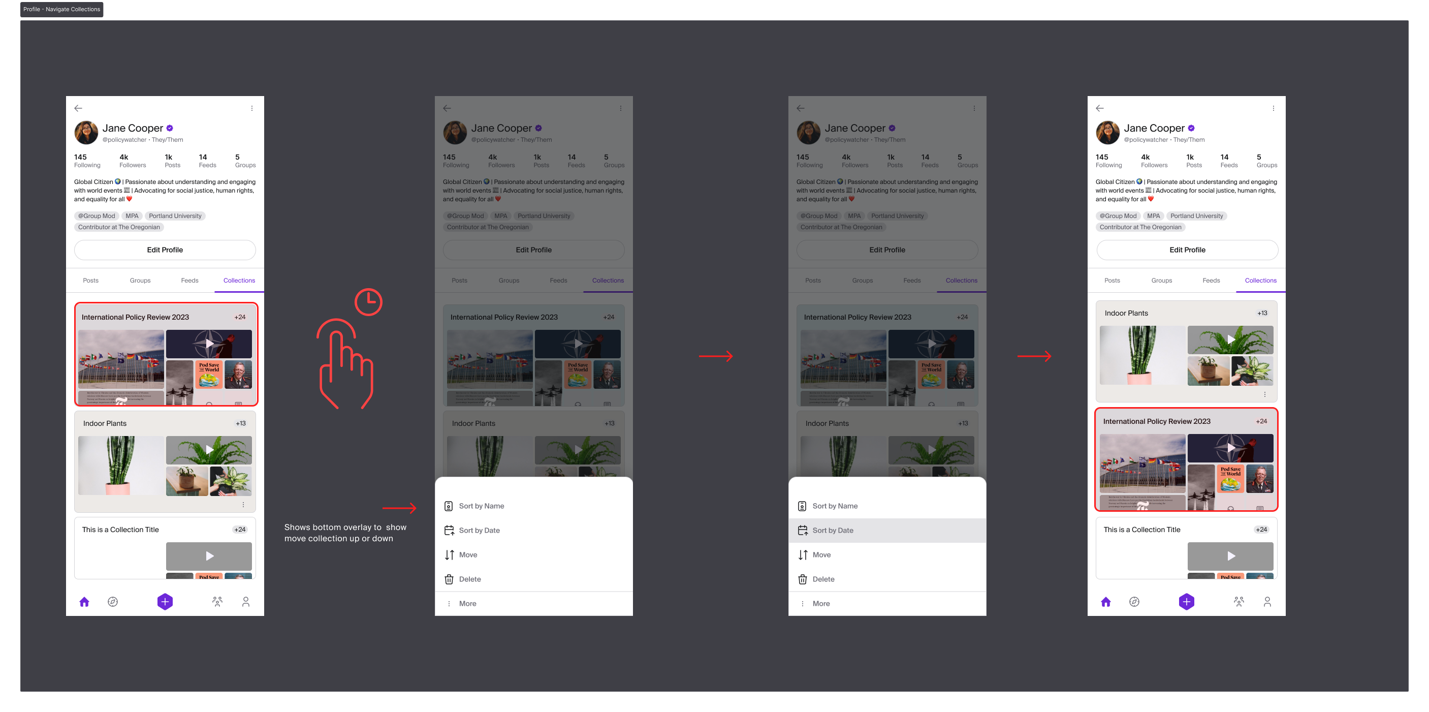
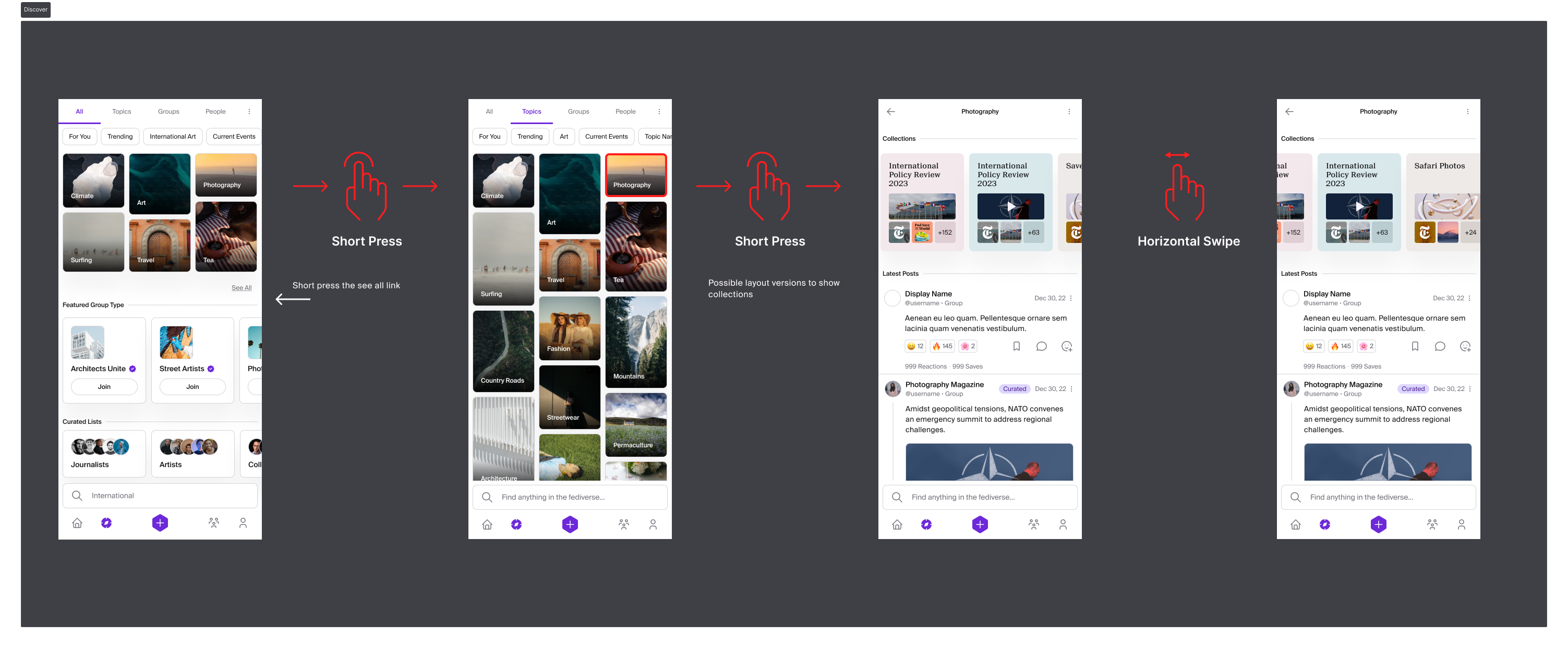
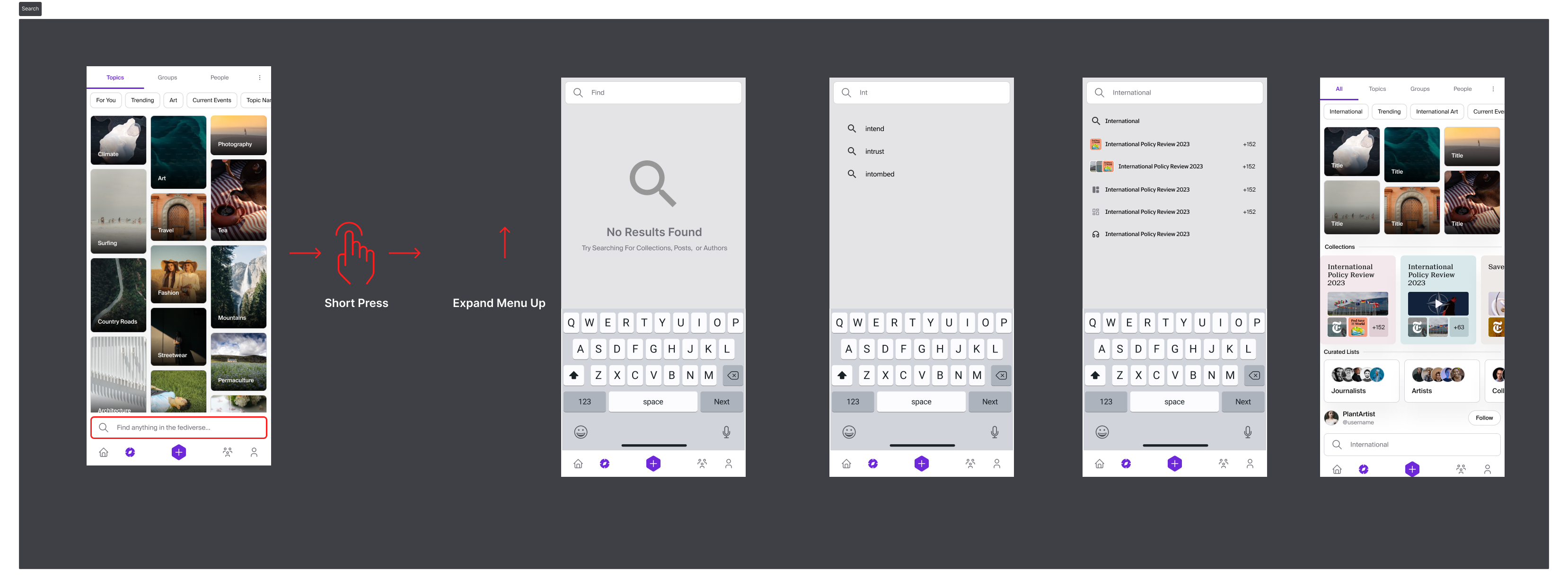
Navigate Collections
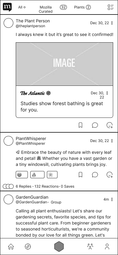
I developed high-fidelity screens to showcase how users would discover and engage with collections in Moz Social. Using Figma, I designed interfaces that highlighted browsing curated lists, accessing multimedia content, and exploring various topics. The screens were crafted for intuitive navigation, with transitions and interactive elements to enhance user engagement. To illustrate the interactions between screens, we incorporated icons of gestures, demonstrating how users could swipe, tap, and scroll through the content. We focused on visual hierarchy and accessibility to ensure users could easily find and interact with content. These high-fidelity mockups provided a detailed and realistic view of the Navigate Collections feature, ensuring a seamless and engaging user experience.
Profile Screens
Discover Screens
Search Screens
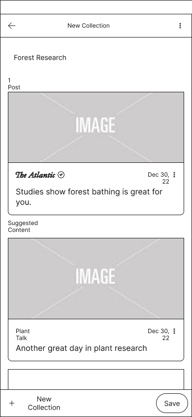
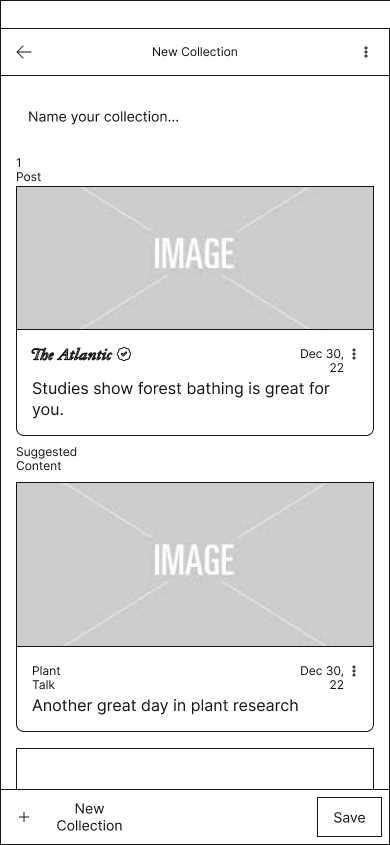
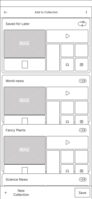
Currating Collections
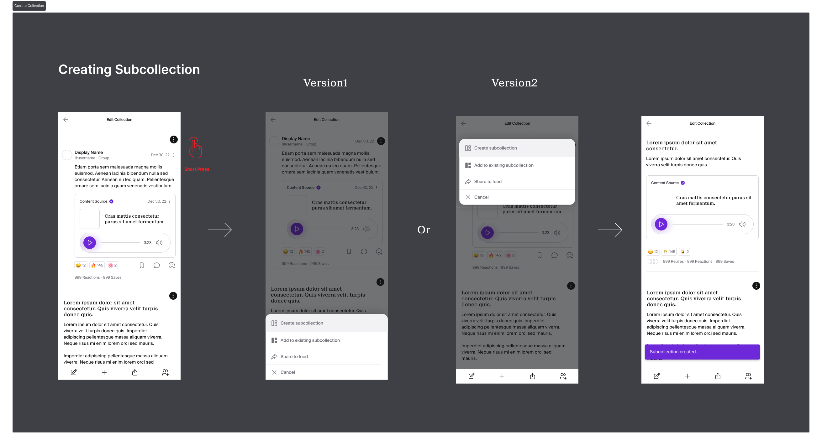
I focused on designing high-fidelity screens that facilitated the creation and organization of collections within Moz Social. Using Figma, we developed interfaces that allowed users to easily select and arrange multimedia content, such as articles, videos, and podcasts, into curated lists. The design emphasized a user-friendly experience, with clear icons and gestures to guide users through the curation process. I included features for adding descriptions, tagging topics, and setting privacy preferences to enhance the personalization and relevance of each collection. These mockups aimed to make the curation process intuitive and engaging, empowering users to create collections that reflect their interests and share valuable content seamlessly.
Creating Subcollections
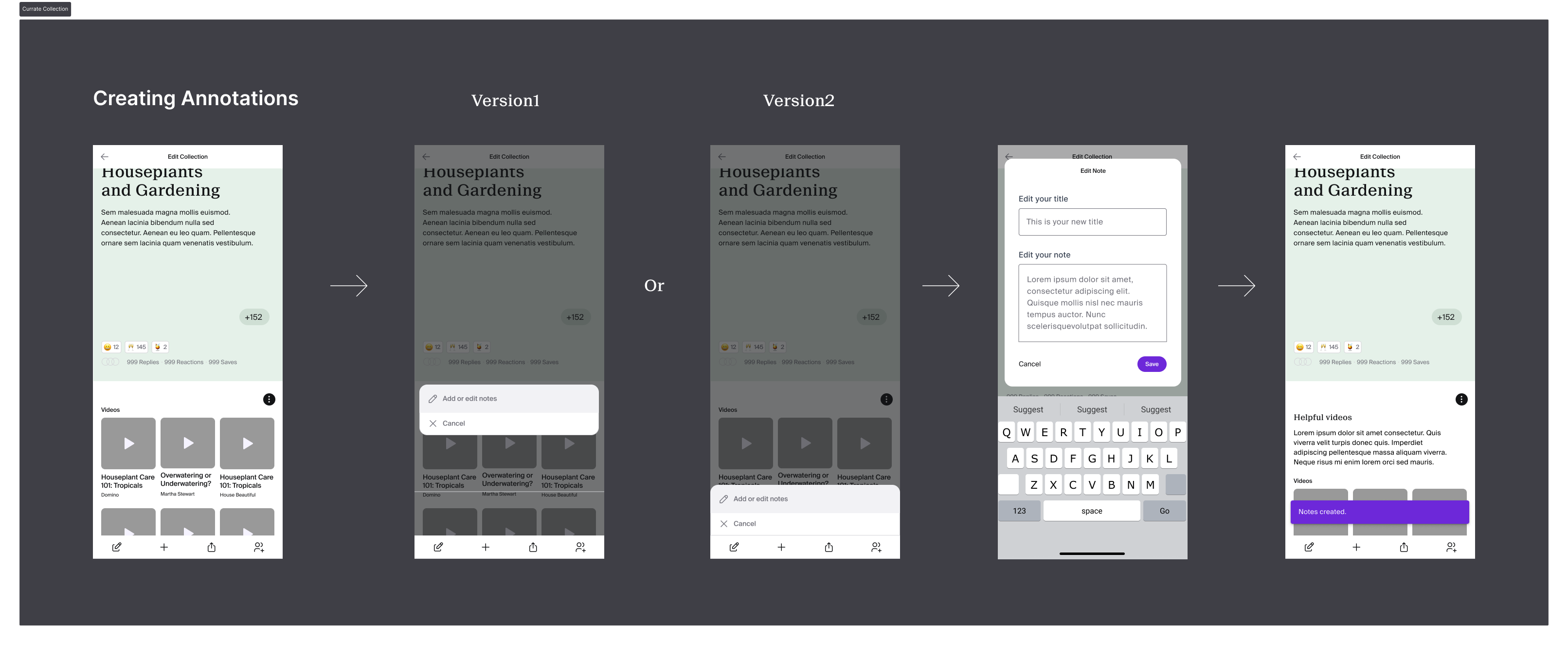
Creating Annotations
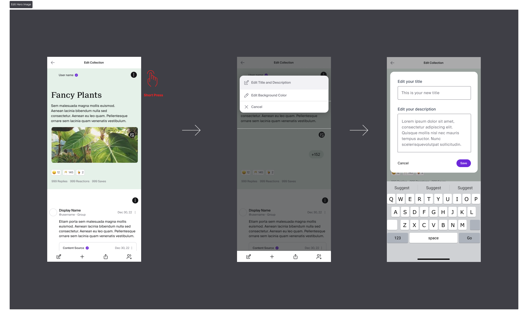
Edit Hero Section
Weeks 5 and 6: Mockups - External Uses
In weeks 5 and 6 of the design sprint, our focus shifted to integrating Moz Social with other social media platforms and news websites. During this phase, we developed designs that enabled seamless sharing and embedding of collections across various external sites. The goal was to enhance user engagement by allowing collections to be easily shared on platforms like Facebook, Twitter, and LinkedIn, as well as within news articles and blogs. We crafted high-fidelity mockups that demonstrated how users could interact with Moz Social content outside the app, ensuring a cohesive experience across different digital environments. These designs aimed to extend the reach of Moz Social, fostering broader content dissemination and engagement.
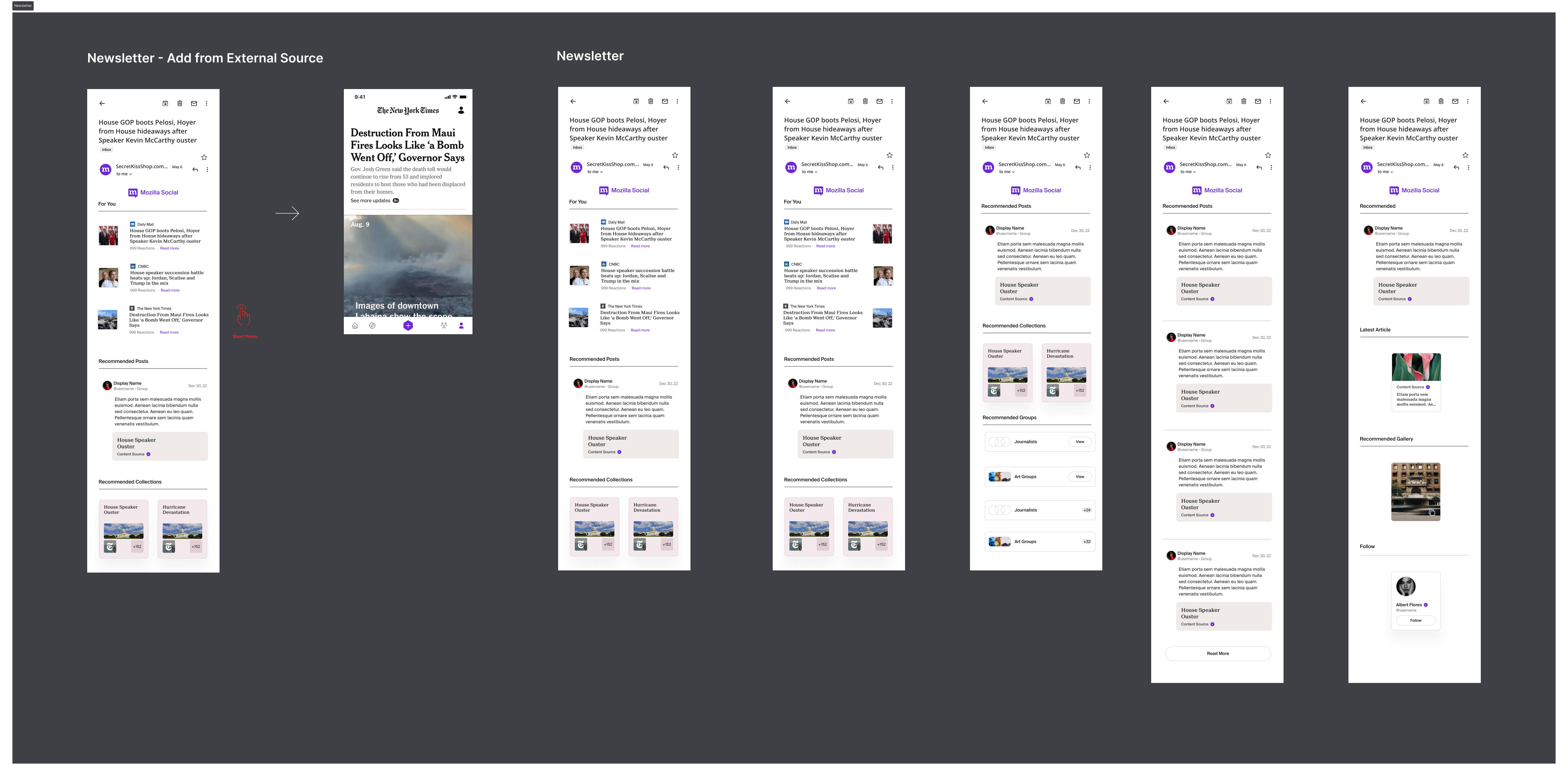
Newsletter
For the Moz Social newsletter screens, we designed a clean and engaging layout consistent with the app's aesthetic. Using Figma, we created high-fidelity mockups with organized sections for featured collections, personalized recommendations, and trending topics. The design includes intuitive navigation and interactive elements like eye-catching headers and call-to-action buttons to enhance user engagement. These screens aim to keep users informed and connected with their interests in an attractive, user-friendly format.
Newsletter Screens
Online Visibility
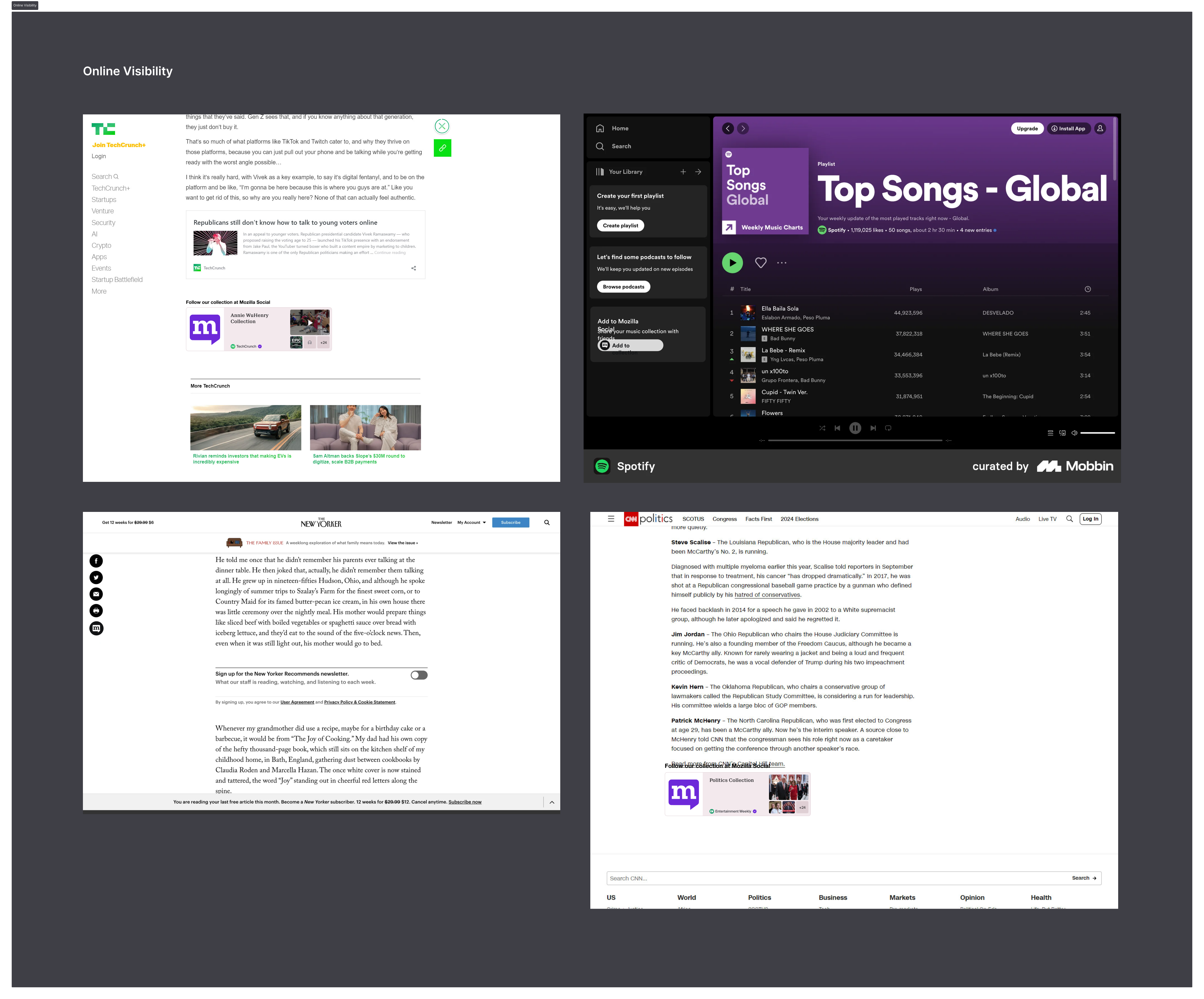
Moz Social will seamlessly integrate with news websites and apps, allowing users to interact with its content directly from external platforms. We designed high-fidelity mockups to illustrate how collections can be embedded within articles, blogs, and other digital media, ensuring a cohesive and engaging user experience. This integration aims to enhance content discovery and sharing, making Moz Social's curated content easily accessible and widely distributed across various digital environments.
News Websites Screens
Conclusion
In conclusion, the six-week design sprint for Moz Social's Collections feature allowed us to develop and refine a key aspect of the app, focusing on creating, curating, and discovering content. Through meticulous research, wireframing, and high-fidelity mockups, we crafted a seamless and engaging user experience that aligns with Moz Social's overall design language. Additionally, we explored the integration of Moz Social with other social media platforms and news websites, expanding the app's reach and usability. Although the product has not yet launched, the work completed during this sprint represents a significant step towards delivering a robust and user-centric feature. My role as a UX/UI designer, collaborating with the team and leveraging tools like Figma, was crucial in bringing these concepts to life, setting a strong foundation for Moz Social's future development.